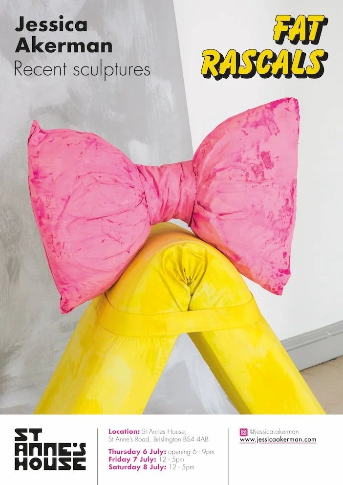
Huge thanks to Kirstie Gregory of the Henry Moore Institute in Leeds for her exhibition review of Fat Rascals - please read below.
I do think work is gendered. But the more personal the process of discovering a gender for the work, or issues about gender, the more interested I am. The way decisions can be ignited beyond manifestos, doctrines and theories is what inspires me. The female occupation of space could begin with an emotional response about a relationship to a certain kind of behaviour.
Phyllida Barlow
This exhibition is inspired by the Pantone Colours of the Year 2000-2023; colours of the beach—rosy coral sunsets, bold blue skies, azure seas, also of the nursery—soft pinks, baby blues, sunny yellows, the colours of discarded plasticine projects and decorated cupcakes. This ‘hidden code’ of a colour scheme holds up a mirror to what for the last 23 years has been considered one of the pinnacles of good taste. And the artist proceeds to question the validity of such an elitist notion. These colours, often representing human skin, are a bit too vivid, too livid, to be healthy. Something unsettling has also happened to scale, said body parts are shrunken, or blown up to extraordinary effect. In Bustle Tongue and Stopper (both 2022) the abstracted muscular organ is an alarming size. WAG (finger hook) (2023), made from polymer clay and wood, is a protruding, dismembered finger is the colour of a cartoon bruise. The pretty glazed porcelain Josiah Heads series (2023) are too small, eerily sightless, yet beam up from the floor at the viewer, tiny freakish playthings urging us to pick them up so they can bite us. Akerman describes the subtle story behind their creation:
The series started as a collection of men traipsing around on Saturday after their wives – a vignette of gender relations. But through making they morphed into a troupe of jolly industrialists. These were in part inspired by the contradictory figures of philanthropic industrialists who created model villages for workers with good living conditions, yet whose hierarchy and implication in the negative social and environmental impact of industrialisation are still felt.
Despite the clouds on the horizon at the seaside, humour appears in abundance. Marble nose on a butcher’s block (2023) might remind the viewer of the wonderful nineteenth-century short story by Russian author Nikolai Gogol, The Nose. In Gogol’s satirical, surreal tale a civil servant is not only alarmed to wake up without his nose, but aghast to discover it has made its way in the world more successfully than him, outranking him and clothed in such a way as to convey ‘it held the rank of a state-councillor’. Just as Gogol uses wit and comedy to poke fun at empty narcissism, Akerman uses nonsensical ideas and imagery to ridicule contemporary society’s value systems, particularly in the area of current perceptions of beauty. Concepts of ideal beauty have changed across the histories of art, but more recently artists have challenged rather than reinforced such ideas; Mossy Leg (2023), Seaweed Groin (2023) and de Bayonne (2022) all display imperfect, monstrous bodies as bold, enchanting and unembarrassed. The latter work on paper adds another linguistic twist to the narrative; Bayonne in France, is famous for its legs of artisanal ham, served up in this painting with added grapes, varicose veins and nail polish. Similar etymological creativity is used in the exotically titled Chilopoda (2022). This bright ceramic plate set on brass castors is a perfect example of the kinds of dichotomy on display throughout the exhibition. Chilopoda gives the impression it might at any moment scuttle under the gallery’s shadow gaps, with its cyclopean single eye and tar-toothed mouth, like much of the work in Fat Rascals, the temptation to touch is short-lived.
Akerman has worked with the idea of scrolls and unravelling for some time, included here is the large installation, Wandering Parts (2022). The artist worked with technicians to adapt three Ikea blinds, using sculptural choreography to create a random sequence of unfurling and rolling-up. She explains her thinking behind these:
These drawings morphed into visual representations of the connections women (in particular) make with each other; the intimacies we share in brief meetings and the closeness you can develop with someone whose social or political values you might not share. The shared experience of the female body leads women to overcome differences to forge really strong relationships.
Such works share the imagery of popular interior design which appears, slightly altered, throughout the exhibition. They also refer, as the artist explains, to the female body as depicted by the British artist Beryl Cook, who was popular in the 1970s and ‘80s. As Akerman explains, ‘The way Beryl Cook played with those forms, and I enjoy the populist reference, especially after reading a scathing review of her work by a well-known male art critic. I think she was very shy in her private life.’ These subtle references to the female experience in society align with Barlow’s words; there is no manifesto here, rather a measured, emotive message.
Turning to the Fat Rascals or as they are officially listed Fat Fingers (and Boobs) (2023), plump and fruity scones, the artist has said that the inclusion of these edible sculptures was intended as a contrasting generosity within the exhibition, ‘in opposition to other more uncomfortable emotions the work is intended to illicit embarrassment, schadenfreude, meanness, the feeling of blushing, social anxiety.’ She also describes the unexpected but satisfyingly appropriate effect of these works as people tentatively ‘danced and dithered’ around the cakes, unsure quite what behavior was allowed in the formal atmosphere of the art gallery. Akerman, like many artists before her who have used edible components in their work, selected prosaic objects to convey complex ideas.
God is in the detail, as is often said, but Jessica Akerman’s most recent exhibition recalls the idiom, extending it into the devil is in the details. Her bright and cheerful art belies first glance. She has frequently worked with preordained colour schemes including, ‘the fluorescents of market signage, or Microsoft’s default colour palette’. It is a subtle and intelligent method of triggering collective memory and industrial choice. Through shades of sunbeams and roses Akerman reveals the disturbing narratives of societal assumptions.
Kirstie Gregory, July 2023